Thursday, October 25, 2012

Swatches of my recent buying regrets.

I still feel oogie, but I am feeling up for posting today. Today I have some polishes I bought recently that I wish I wouldn't have. You'll see why in the following pictures and descriptions. Have you ever bought a polish that you loved in the bottle, and in concept, but it turns out to just suck? That's what these are.

First up: Piggy Polish Lightmare


Direct Sunlight

Indirect Sunlight

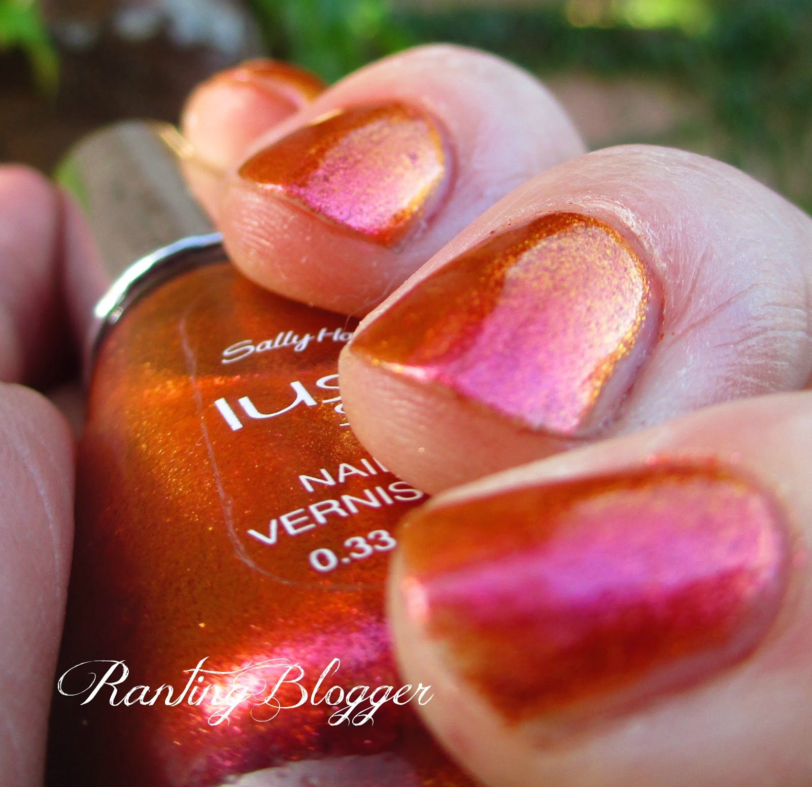
Now at first glance you may think "It just looks like you didn't clean your cuticles" but I assure my friends, that there was much scrubbing of the cuticles involved. This crap WOULD NOT COME OFF. Nightmare, I tell you. I wore this polish one other time (thankfully with a glue basecoat) and the formula was great. The second time. Agh...lumpy disaster. It was so thick it was almost unusable. That makes me sad, this polish is such a unique color. Maybe if I buy some thinner I can save it, break it out next halloween, wear it once, and put it away. lol.

The next two, one is a formula suck and the other is a brush issue. Mind you I forgot to take pics of the actual brush. Lol. 

That's right. Colors from the L'Oreal Project Runway collection. I'm sad that I don't have cable right now because I LOVE THAT SHOW and it isn't on Hulu or Netflix.


First up, The Temptress's Power. This was the one I was more excited for. It looks soooo horrible on its own. I look diseased. Also, that is not dirt under my nails, That is some weird space that isn't white or the color of my nails...I don't know, I've always had that. I think this is four coats.


So diseased....ugh. And notice Lightmare is STILL stuck on my cuticles. Still. That crap would NOT come off.


Over black it turns into a very pretty green color. If I ever wear this polish, this is how I would wear it. I haven't tried wearing it over a nude, to get the bottle color. Can anyone recommend a color to wear underneath it to get a similar color to the bottle? I like the color, it's just way too sheer for my liking.


Now, The Mystic's Fortune is beautiful. It's gorgeous. These pictures don't do this polish justice. Enlarge the bottom one to see all the gorgeous purple, pink, and blue shimmer. The brush on this however, was jacked. It was cut at an angle so extreme it made the brush smaller than an Essie brush. Another reason I regret buying this is:

How many dark purples with shimmer do I need? I'm sure this isn't even all of them. From L-R: The Mystic's Fortune, Opi Ink, Unnamed color club (any ideas? I got it from Walgreen's for .99), Wet N Wild Toxic Apple, Orly Mysterious Curse, Deborah Lippman Dancing in the sheets, and  The Mystic's fortune again.

Sigh. Have you bought anything recently that you wished you wouldn't have?

I hope you guys have a great day!

Monday, October 22, 2012

Sorry Guys.

Sorry friends, I'm having a bit of medical trouble this week, and I'm afraid I am probably going to have to drop out of the This is Halloween challenge. I'm on some pretty hefty painkillers, and I probably couldnt paint a crooked line on my nails right now. They make me loopy!! I'm hoping I get better soon, and I will be back to posting.

Thanks for understanding, I know I seem to be having a lot of medical problems lately, but I'm trying to get better.

You guys are awesome.

Wednesday, October 17, 2012

My Picks from the Wet N Wild Pick Your Poison Collection


Hello Friends! Today I have the polishes I picked up from Walgreen's the other day from the new Wet N Wild Megalast Pick your Poison collection. I did not pick up the charcoal grey (it reminded me of Essie Over the Edge which I never use. lol..) or the bright blue (I have an NYC that is pretty similar). All of these are 2 coats with topcoat, I did however take the photos for Toxic Apple on a different day, so my nails look different.  


Nail Wheel Swatches


 Deadly Dose Direct sun, sorry about the shadow, best pic I had for the sun photos.
Shade

Deadly Dose a warm, yellow gold color. I bought this one purely because I do not have a gold this color. It's okay...not fantastic. Very streaky...Sparkly in the sun though. Formula is ok.

 I must have taken these before I squared off my nails...that angle looks funny...lol Direct Sunlight
Lethal Injection Shade
Lethal injection is a red based purple, or a deep purple-y red. It's not quite purple...and it's not quite red. Strange color. Once again, twinkly in the sun...streaky in the shade. Still pretty either way.


Toxic Apple  Direct sun

Toxic Apple Shade

Toxic Apple is one of my two favorites in the collection. It's a dark blurple, and in the sun it twinkles with blue and pink sparkles. It's beatiful. In the shade it's not as streaky as the others, and it really is very beautiful.


 Poison Ivy Shade, Note, that is NOT poison ivy that I am holding. lol.
Poison Ivy Direct sun


Poison Ivy is my hands down favorite of this collection. The base is a blackened green color with brighter green shimmer. The sun pic reminds me of The Matrix. I don't know why. This polish is beautiful. I did, however, experience some cuticle drag, that you can see on my middle finger. It's ok though, beautiful polish wins out over minor inconveniences.


What I liked: Pretty colors. I don't have anything like the ones I picked. Very twinkly in sun light. I'm a sucker for a good shimmer.

What I didn't like: Ugh that horrible brush on the megalast line...ugh...its awful. I find myself having to paint very very slow in order to not just paint my whole hand that color. lol.

Overall: I liked these. They aren't WOW outstanding, but I'm not sad I bought them.

My picks: Toxic Apple and Poison Ivy

Did you pick any up?

Note: I bought these with my own money, they were $1.99 Each at walgreens, no one is forcing me to write this post.

Tuesday, October 16, 2012

Halloween nail art spam

Hello friends!! Today I have for you a random sampling of some halloween themed nail art that I have done in the past two weeks. Some of these are pretty effed up. Lol. I just wanna share them, good, bad or otherwise. Here we go!!

This is one of my favorites. I did not realize it was chipped until I was editing these photos. Whoops!  For a base I used L'oreal Park Avenue Luncheon (2 coats) then I used a coat of Sally Hansen Diamond Strength Glass slipper, followed by a coat of Sally Hansen Insta-dri Beige Blast. Not satisfied with Glass slipper, I added a coat of Sally Hansen Diamond Strength White Veil, and A coat of Jordana Bronze Fest, and finally a coat of Beige Blast again. It reminds me of fall!!!


 The next day I added some stamps! I stamped using BM 13 from the first Bundle Monster Set. For the polishes I used OPI Chop Sticking to my Story for the webs, and Wet N Wild Black Creme for the spidies. SPIDIES!!! squee.

My camera is making these look different, but this is my orange ombre! Yay! From thumb to pinkie I have OPI Chopsticking to my story, Sinful Colors Citrine, Essie Orange, it's obvious!, Essie Fear or Desire, finally Essie Action. I must have been on an Essie kick when I bought all those oranges. That and orange was popular this spring.


Halloween tribal!! Yay!! Actually this looked way worse in real life. It looks bad here...but it looked worse...For the base I used Essie Fear or desire? The green is OPI Hot Fun in the Summer-lime, the purple is just a purple from one of those sets you get at Burlington Coat Factory, the yellow is Sally Hansen Insta-dri Express-so Yellow and the White is Milani White on the spot. The black lines are just acrylic paint.


This one is from a tutorial! This one from ArcadiaNailArt. I used L'oreal The Mystic's Fortune as my base, and then used Sinful Colors Happy Ending for the slime. The glitter is Orly Spazmatic and Can't Be Tamed/ The rest of the "art" is paint. I can't paint small details to save my life. The following picture is my left hand doing the same design.


This was too funny not to share. Are those supposed to be spiders?! they look like blobs, or some sort of pictoral representation of germs. This is too funny. The blue is actually the paint from my paint brush handle coming off onto my hand. Ugh. lol.

Did you do anything fun for halloween nail art?

Thanks for reading! I appreciate all of you.

Monday, October 15, 2012

TIHC: Jack O lanterns AND Zombies!

Hello Ladies, I'm gonna keep this short as I have a paper to write, math homework to do, an art project to finished that I've barely worked on, and a chapter to read before wednesday. So, quick, unadulterated, barely looked at photos of zombie nails and my catch up photo for jack o lantern day.


Haha for creative posing I suppose!


Bloody Brains! I did your typical drip mani you see all over the place with a franken jelly I made from a pre-existing pink franken, a little black, and NYC Lincoln Center.


For the underneath part, I had my partially removed Orly Preamp, then sponged with Revlon Flirt, then sponged with NYC Lincoln Center, and finally sponged again with Orly Decades of Dysfunction. Then I used an unnamed Color Club (I think its She's sooooo glam but I can't be sure) to paint the brain bits.


This is my Jack o lantern mani. Notice this is before I nubbified my nails due to massive breakage. I used a base of OPI Did you ear about Van Gogh? Then I did a splatter mani with China Glaze Immortal, Orly Nite Owl, and Orly Faint of Heart. Then I stamped using WnW Black Creme and CH222 and CH 224. Then I used the brush from Black Creme to draw the ground. Finally I used a dotting tool to dot in the eyes and mouth on the pumpkins with China Glaze Orange you Hot?


Hope you enjoyed these manis! I will be back in a couple days to show you some other halloween themed mani's I have done. (I've done one nearly every day this month so far)

Check out the other girls' manis!


Wednesday, October 10, 2012

*PIC HEAVY* Swatch and Review Sally Hansen Lustre Shine Polishes


Hello Friends! Today I have for you my first review! I know that these have been out for a while now but I wanted to make sure that I show you guys these! They're pretty much awesome! This post is very pic heavy so I'm going get going. Note: I did not buy the Chanel Peridot dupe because I already have OPI Just Spotted the Lizard, also, the swatches I took for Moonstone and Scarab turned out badly, so you have different pictures for those. These were also taken before I changed my nail shape (again).

Swatches on a bare nail wheel, no top coat. 2 coats CH, MB, Scarab, 3 coats Lava and FF
 1 Coat over black


Sally Hansen Moonbeam a pearlescent white polish that has a strong pink shift. I expected this to be super streaky, but it really isn't. I wish my other swatches weren't so bad because this polish is beautiful. It reminds me of pearls. It has a very pearl-like finish. I love it. Over black it turns into a polish very similar to that of Wet N Wild Grey's Anatomy or Revlon Smoldering minus the glitter. I believe this is 3 coats.


 direct sunlight

 Indirect sunlight for this one and the ones below


 Sally Hansen Firefly has color shifts from gold, green, pink and a tiny hint of red and purple in very extreme angles. This polish is gorgeous. I was wanting Swanky Silk by China glaze. Lemming gone. From what I have seen of swatches, this is better. Every color you seen in the bottle is on the nail. 3 coats.


Direct Sunlight
 
 Indirect sunlight for this one and the ones below. Yes, that is the same polish


 Sally Hansen Copperhead. Oh. My. God. I nearly died when I swatched this. No seriously. Get it. It's the strongest shifting polish I have ever seen. It's copper-y gold in direct sunlight and deep purple in others. The streaky-ness is outweighed by its awesome. No joke. It looks terrible in the bottle, gorgeous on the nails. 2 coats.


 Direct Sunlight
 Indirect sunlight


 Sally Hansen Lava, another extremely strong shifting color. This was the one that everyone was excited for, and I was let down. Yes, it's pretty. But I prefer Copperhead or Moonbeam actually. It's a primarily pink polish that shifts to yellow-gold. Pretty in it's own right, not my favorite. 3 coats.


Sally Hansen Scarab. Another favorite. Extreme close ups!! the first blurry pic is the color in direct sunlight the second one is indirect sunlight at a different angle. Obviously the color shift isn't nearly as dramatic as that, but you can definitely see the different colors on your nail at any given time. If you look closely you can see the dark blue at my cuticle and a teal color towards the free edge, and a more green color towards the sidewall of my nail. Look at the bottle. That is what your nail would look like. It's beautiful, and from what I can tell better than the China Glaze alternative.

What I liked: The color shift is gorgeous in all of these. The colors besides Lava didn't get a lot of hype, I'm guessing because they are similar to what other companies released, but they are spectacular. Twinkly in direct sunlight, and beautiful color payoff in the shade. I wish I had other bottles like this to compare, but alas, I do not. The formula is wonderful as well they went on smoothly, and weren't too thick, or too watery.

What I didn't like: I did have some slight bubbling, but that could be for a number of reasons, so I won't put that on the formula's fault just yet. The price point is a little ridiculous  at $8.49 according to walgreens.com but I don't believe I paid that much. The bottle is small, .33 Fl Oz. and as you can see in my bottle shot, I had already used a bunch of Moonbeam because I had already swatched that.

My Picks: Copperhead for sure. Followed by Moonbeam, Scarab, Lava, and Firefly in that order. I love these. I want 4 back up bottles of each, but my budget doesn't allow for that.

What do you think? If you haven't bought any of these already, I would!!!

Have a wonderful evening!